Spreading connection with nature.
Garaman Foundation

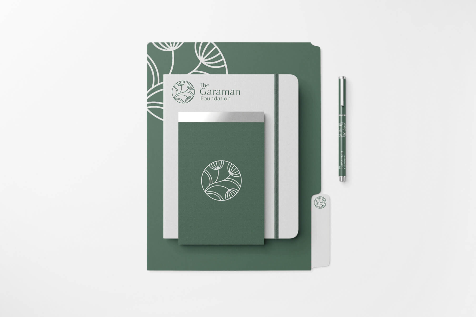
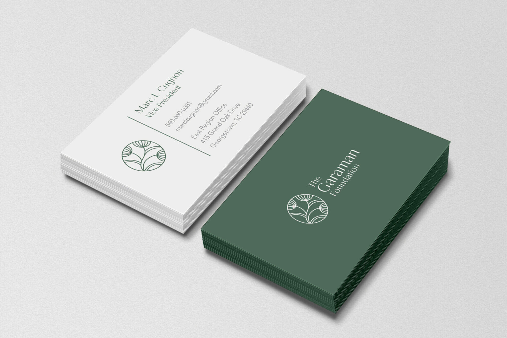
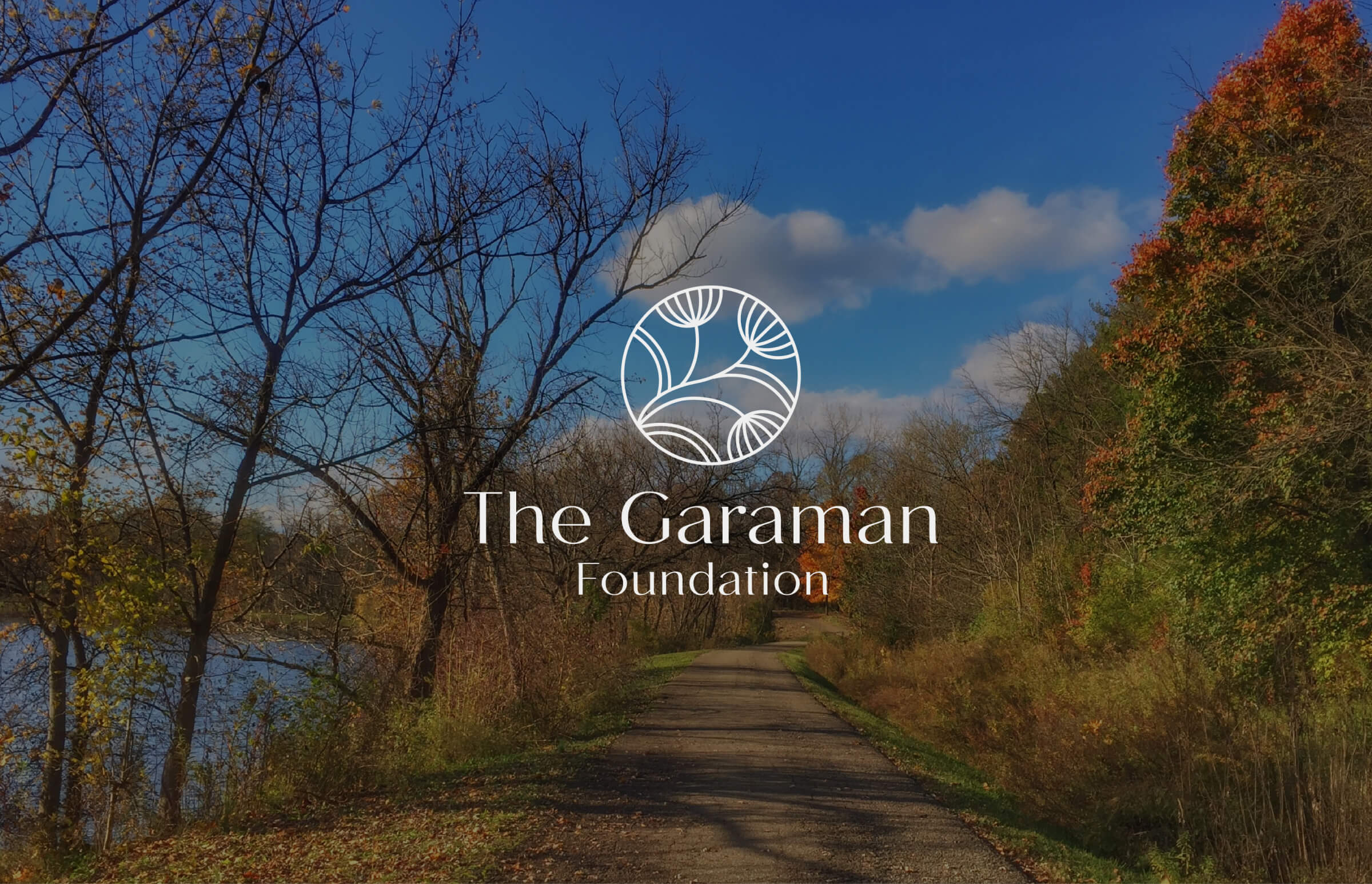
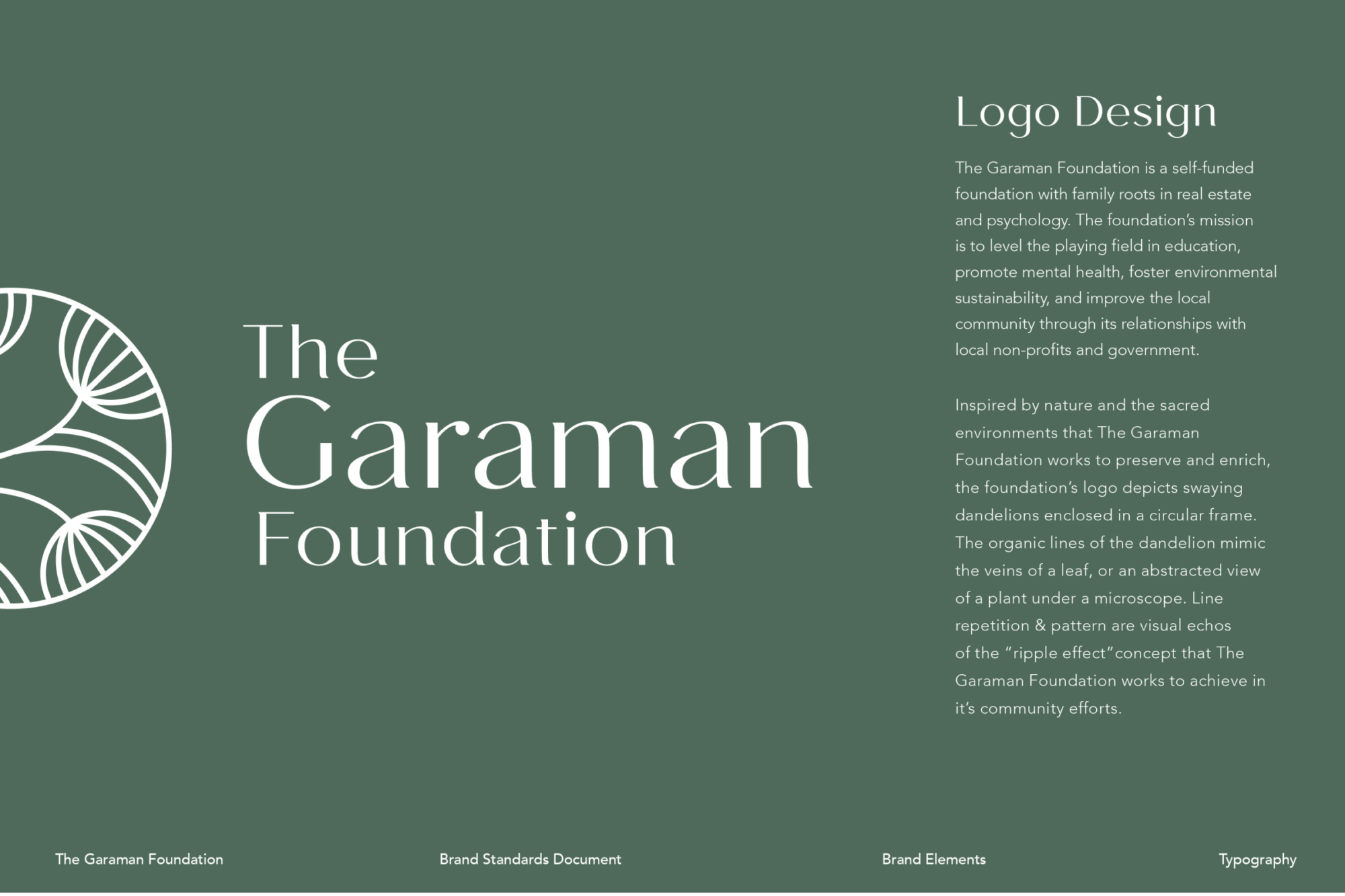
Inspired by nature and the sacred environments that The Garaman Foundation preserves and enriches, the foundation’s logo depicts swaying dandelions enclosed in a circular frame.
The Garaman Foundation is a self-funded foundation with family roots in real estate and psychology. The foundation’s mission is to level the playing field in education, promote mental health, foster environmental sustainability, and improve the local community through its relationships with local non-profits and government.

Dandelions were chosen to represent the spreading of a seed, idea, or message: one of prosperity, growth, and the nurturing of a greater ecosystem.
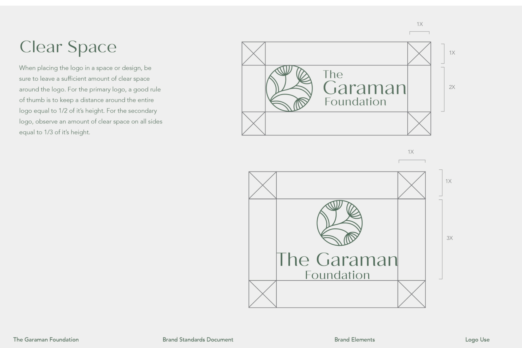
Line repetition & pattern are visual echos of the “ripple effect” concept that The Garaman Foundation works to achieve in its community efforts.
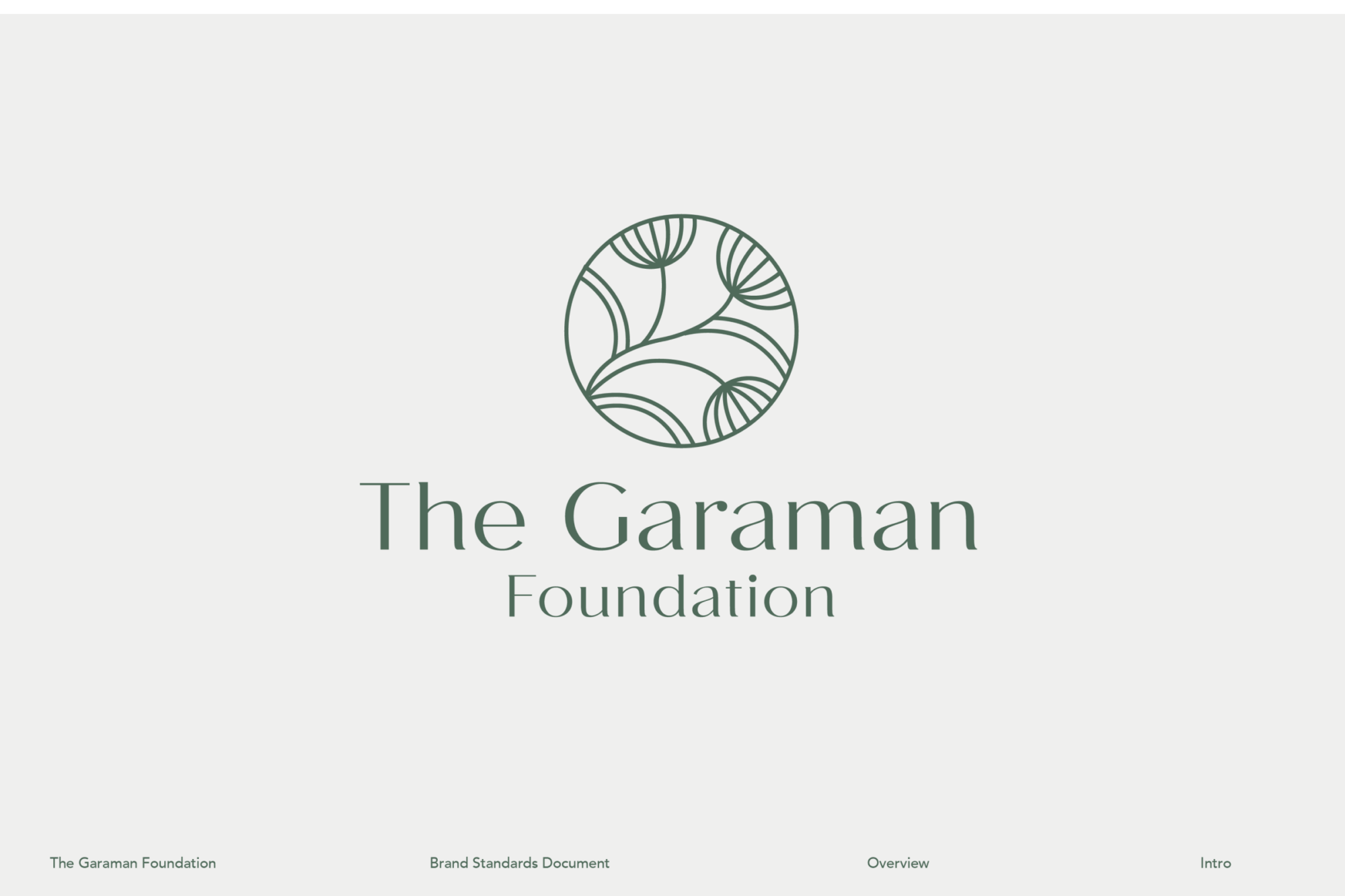
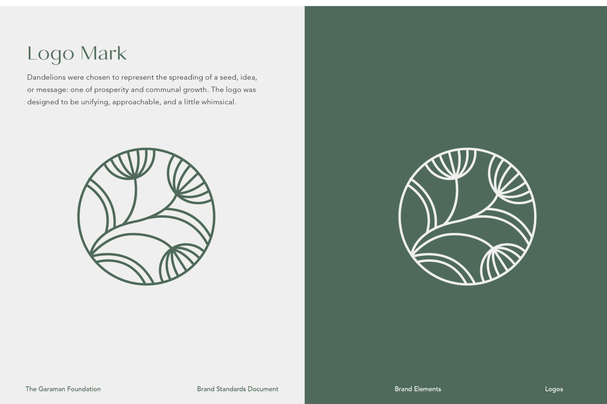


The overall identity of the foundation was designed to be unifying, approachable, and a little whimsical.
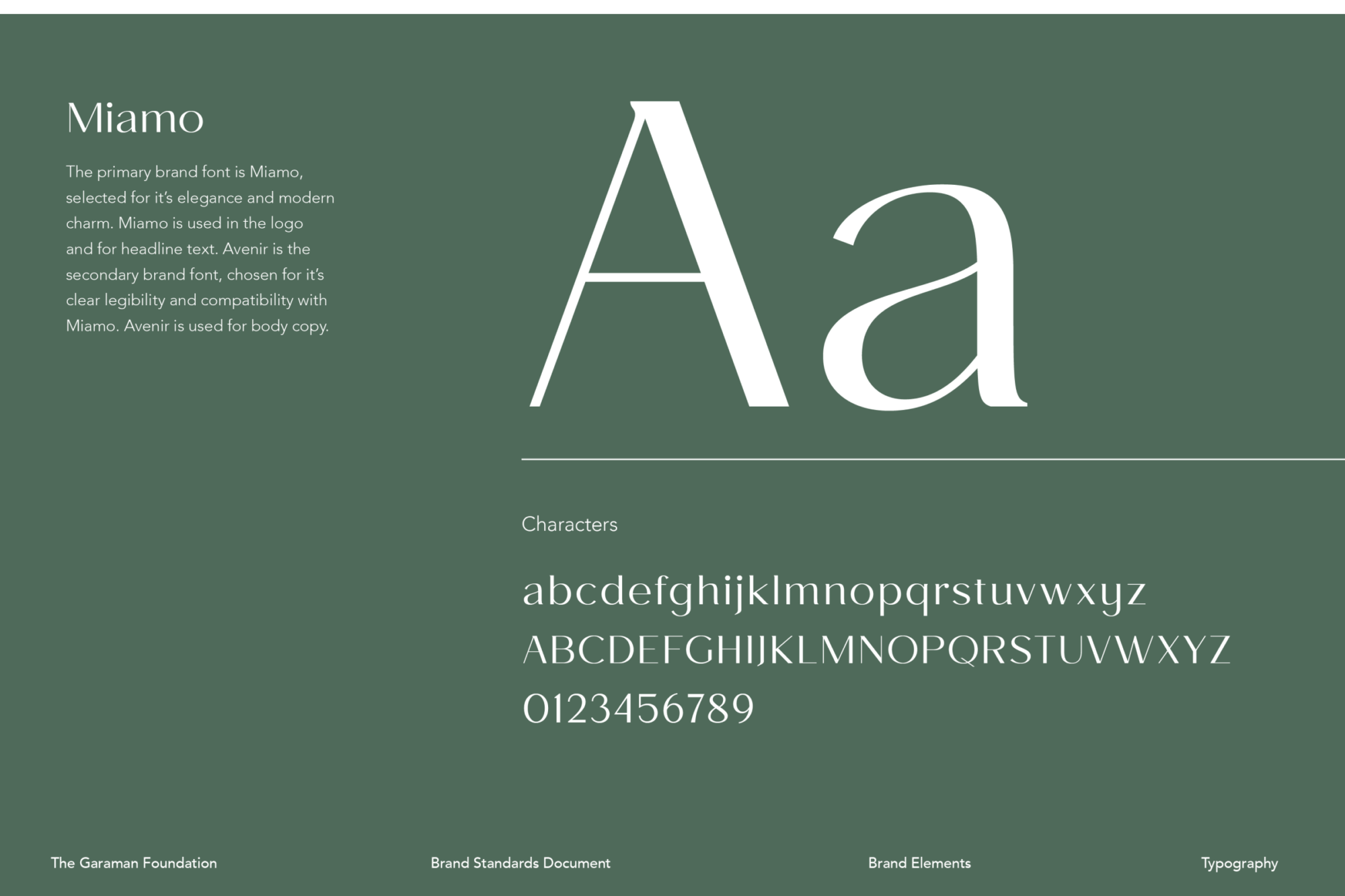
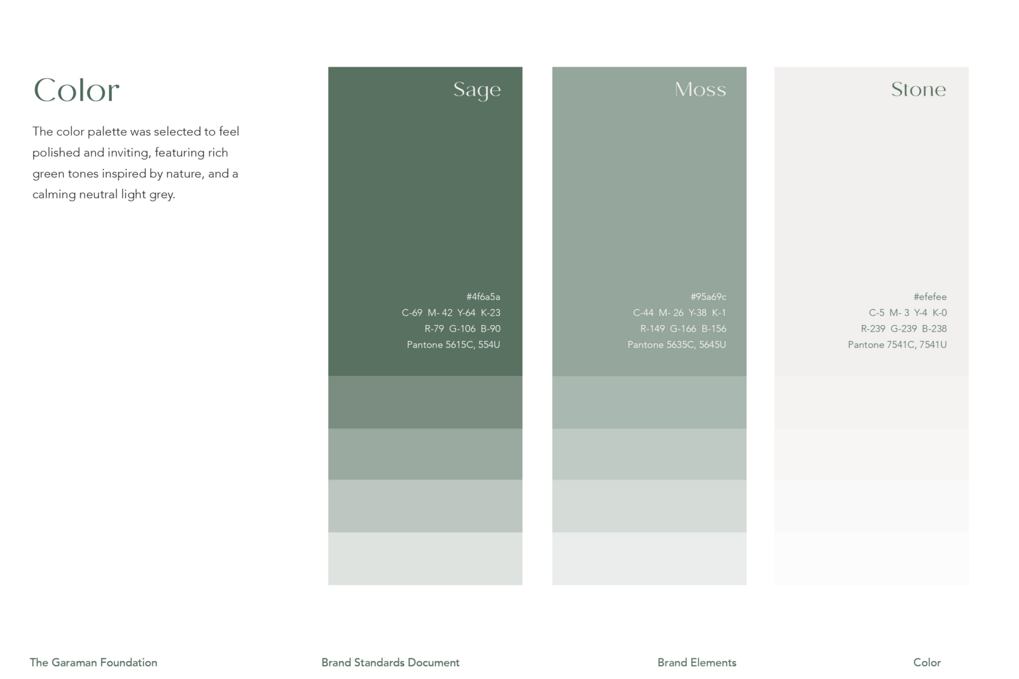
The color palette was selected to feel polished and inviting, featuring rich green tones found in nature and a calming neutral grey. The brand font, Miami, was selected for it’s elegance and modern charm.